Accordion
Accordion is implemented using ExpansionTile.
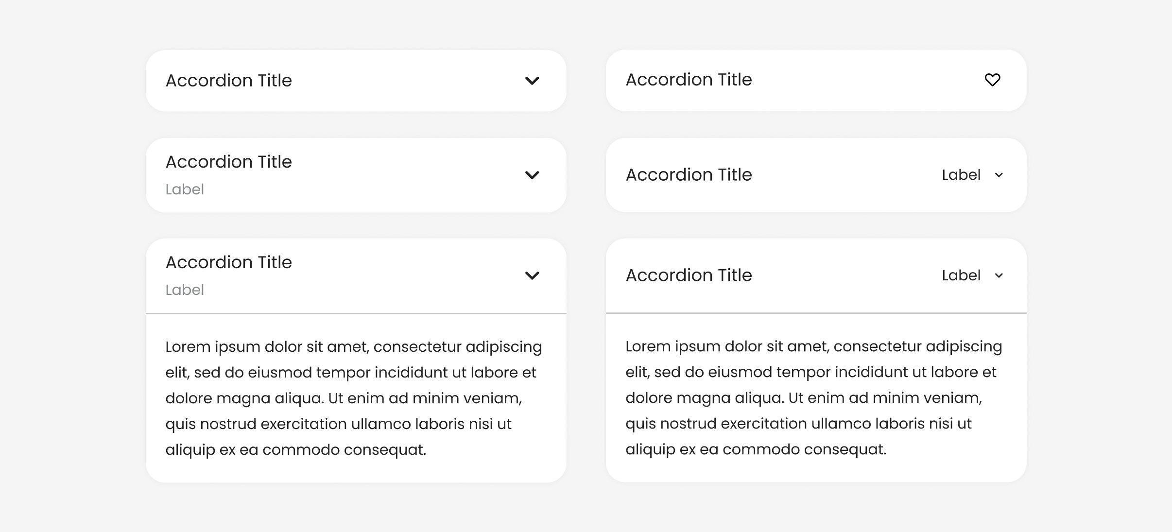
Accordion
Default
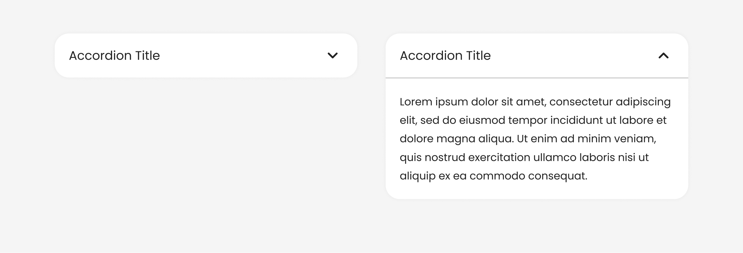
Accordion(
    title: Text('Accordion Title'),
    expandedContent: [Text('Lorem')],
)
Flush
Add effect: false to remove the default background color, some borders, some rounded corners, and effect.
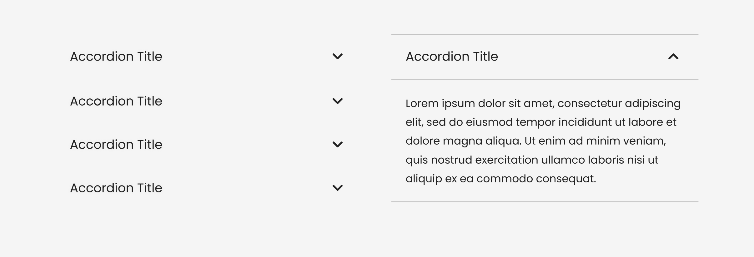
Accordion(
    title: Text('Accordion Title'),
    expandedContent: [Text('Lorem')],
    effect: false
)
Subtitle
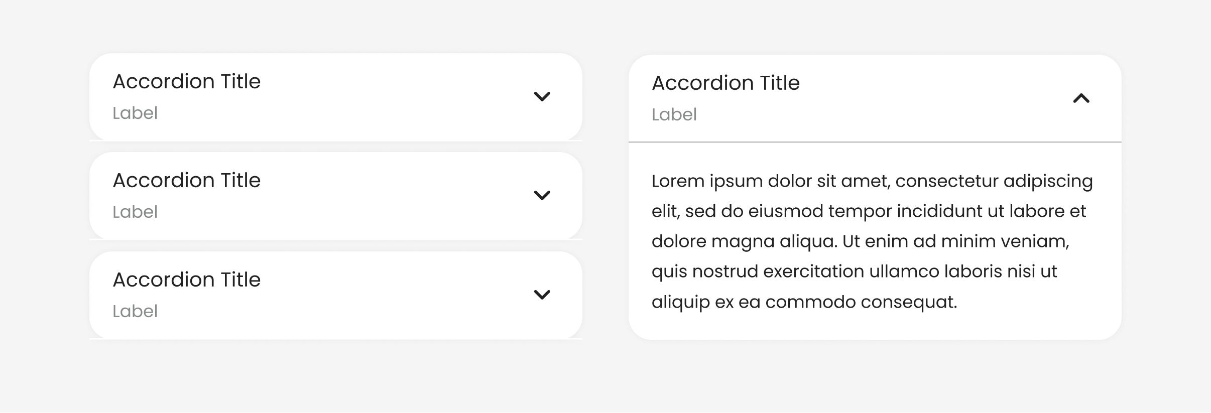
Accordion(
    title: Text('Accordion Title'),
    subtitle: Text('Label'),
    expandedContent: [Text('Lorem')],
)
Trailing
The expansion arrow icon is shown on the right by default. This can be changed using trailing.
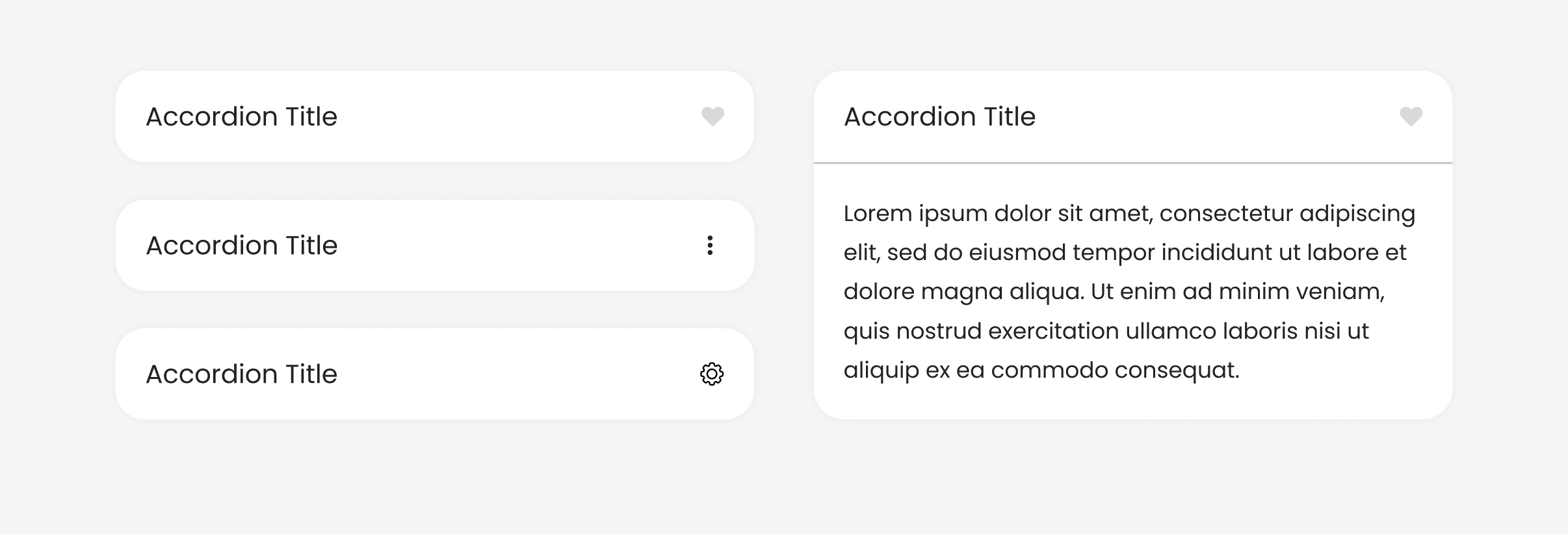
Accordion(
    title: Text('Accordion Title'),
    expandedContent: [Text('Lorem')],
    trailing: Icon(Icons.favorite),
)
Use textArrow for add text with arrow icon.
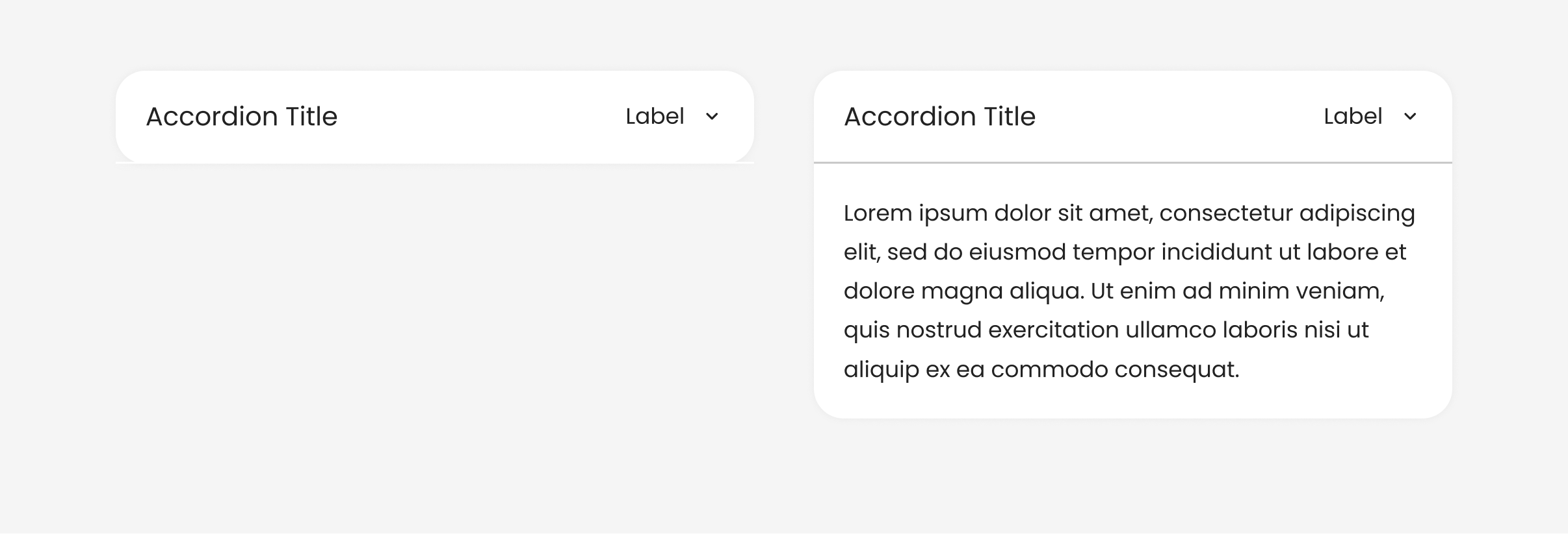
Accordion(
    title: Text('Accordion Title'),
    expandedContent: [Text('Lorem')],
    textArrow: 'Label',
)
Example
import 'package:saber_flutter_ui/saber_flutter_ui.dart';
void main() => runApp(const MyApp());
class MyApp extends StatelessWidget {
const MyApp({Key? key}) : super(key: key);
static const String _title = 'Accordion Code Sample';
Widget build(BuildContext context) {
return MaterialApp(
title: _title,
home: Scaffold(
appBar: AppBar(title: const Text(_title)),
body: Center(
child: Accordion(
title: Text('Accordion Title'),
expandedContent: [Text('Lorem'),]
)
),
),
);
}
}